
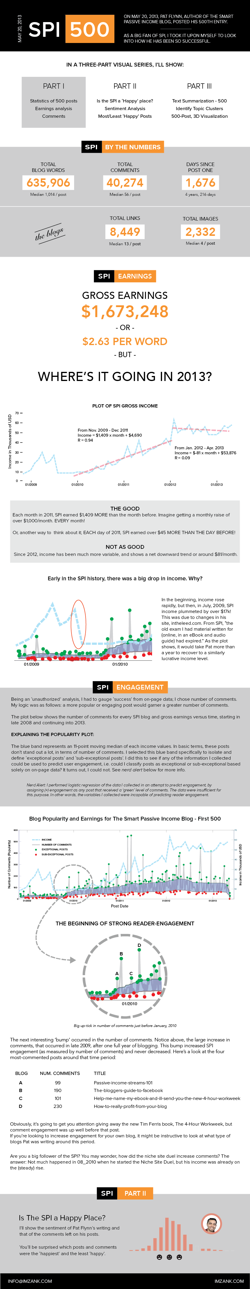
Here is an In-Depth Look at Pat Flynn’s Smart Passive Income
As Pat Flynn neared his 500th blog post of the Smart Passive Income, I saw an opportunity to evaluate just what has made him so popular over the years and what has caused his blog to grow to the level where he can earn over $60,000 per month, 100% passively. It turned out to be a fascinating journey through hundreds of thousands of words. The infographic below gives all the details for this part one of a three-part series on just what makes the Smart Passive Income tick, and where it’s going in 2013.
The three parts I’ll cover are:
Part 1:
- Statistics of 500 posts
- Earnings analysis
- Comments, as a measure of success
Part 2:
- Is the SPI a ‘Happy’ place?
- Sentiment Analysis
- Most/Least ‘Happy’ Posts
Part 3:
- Text Summarization – 500
- Identify Topic Clusters
- 500-Post, 3D Visualization
I hope you enjoy this series. Please let me know if there’s an aspect of the Smart Passive Income you are anxious to learn about, and I’ll see if the data have anything to say about it.
Click here to open infographic.
Since this is a start-up blog, I’d like to share a bit about my methodologies and tools I used in making this infographic (it gets a bit nerdy below here, glasses with white tape in the middle, highly recommended)
How I did it: Part I, From the Beginning:
The first step was to acquire the 500 files, with comments. The web scraping that allowed me to download all 500 blog posts was done in pure PHP, with heavy use of XPath. If you don’t know much about XPath, there’s an amazing Chrome plug-in called XPathHelper. That alone saved me hours of time viewing the source and looking through tags, classes and selectors. Once I was armed with the correct XPath string to extract what I needed, I ran the following function, over and over and…
|
1 2 3 4 5 6 7 8 9 10 11 12 |
function getBodyText($URL, $xpathStr){ $html= file_get_contents($URL); $dom = new DOMDocument(); @$dom->loadHTML($html); $xPath = new DOMXPath($dom); $link = $xPath->query($xpathStr); foreach ($link as $e) return $e->nodeValue; } |
This returned a directory of html files. Local extraction of key metrics was then much faster. I wrote another PHP script to remove the line feeds and commas so that I could save a CSV file of all the metrics and the full-text (without the unnecessary commas). Here are the important lines that did just that and saved the CSV:
|
1 2 3 4 5 6 7 8 |
// Remove all commas $fullText = str_replace(',', ' ', getBodyText($file, $fullTextXpath)); // Remove all line feeds $fullText = preg_replace("/\s+|\r\n+|\r+|\n+|\t+/u", " ", $fullText); // Capture the number of words $numWords = sizeof(explode(" ", $fullText)); // Save file fprintf($fidBlogFullTxt, "%s,%d,%d,%d,%d,%d,%s\n", $file, $age, $numComments, $numWords, $numLinks, $numImages, $fullText); |
Armed with all the relevant data, I now began to chew off chunks of the analyses. The first step was to grab a bunch of interesting, overall statistics.
I used Matlab to read-in the CSV file and compute the important statistics. A quick note on the main numbers in the first part of the infographic: I used median values because number of words/blog and many of the other numbers didn’t follow a Gaussian distribution. Rather, they were much more log-normal. So, rather than transforming into log space, I just reported the medians, omitting the quartiles for clarity of presentation.
Next on the infographic is the income report, which is almost a perfunctory look at where the SPI is headed. I’ll say that I believe this to be interesting, but somewhat lacking a better predictive model.
The engagement plot was all done in Matlab. The blue band running through the data, was constructed in Matlab using a median filter with a window width of 11 samples. I chose 11 samples to minimize the end-conditions while still sufficiently smoothing the result. This median filter value is never shown. Rather, I used a 1.5x multiplier on the median filter to designate high and low bounds on the number of comments to consider exceptional and sub-exceptional, respectively.
I did this mainly to be able to attempt to predict which blog posts would garner either great or poor response, in terms of comments. As I mention in the infographic, the on-page data I collected were insufficient to provide a result such as: “yes, a greater number of words (say, over 900/post) lead to increased reader engagement”. But that is simply not the case. There were no significant relations between any of the on-page data I collected and the number of comments. Hmm.
To dive deeper into discovering what makes an engaging post and what does not, I would need access to analytics data that I didn’t have.
In the next part, I’ll go over the tools I used to analyze the sentiment of the Smart Passive Income blog AND its commenters. I’ll show how I used a suite of freely-available tools and show you some code that will help you do it yourself:
UP NEXT in Part 2: I’ll show you how I use the following free or open source tools:
- Python for sentiment analysis
- Cluto for dimensional reduction, clustering and document/corpus summarization
- Knime for word-cloud formation
- Processing for 2D and 3D visualizations
I hope you enjoyed this. If so, please like it. If you have questions, comments or suggestions, please leave them below.


Very cool. The only comment I have is the Pat’s income is not “100% passive”, unless you call blog posts writing passive…