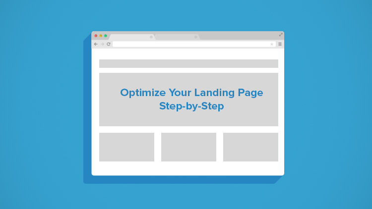
Optimizing Your Landing Page
In this post, I’ll go over the process of completely overhauling my zankme.com landing page. I’ll cover the reasons for the overhaul and my thoughts behind each change/update along the way. I’ll start with my motivation for getting into this huge task: conversions. They were just too low. Something was wrong. I’ll show you how I went about fixing it, including identifying key areas for improvement that you may be able to use on your own site. first a quick overview of what zankme.com is/does.
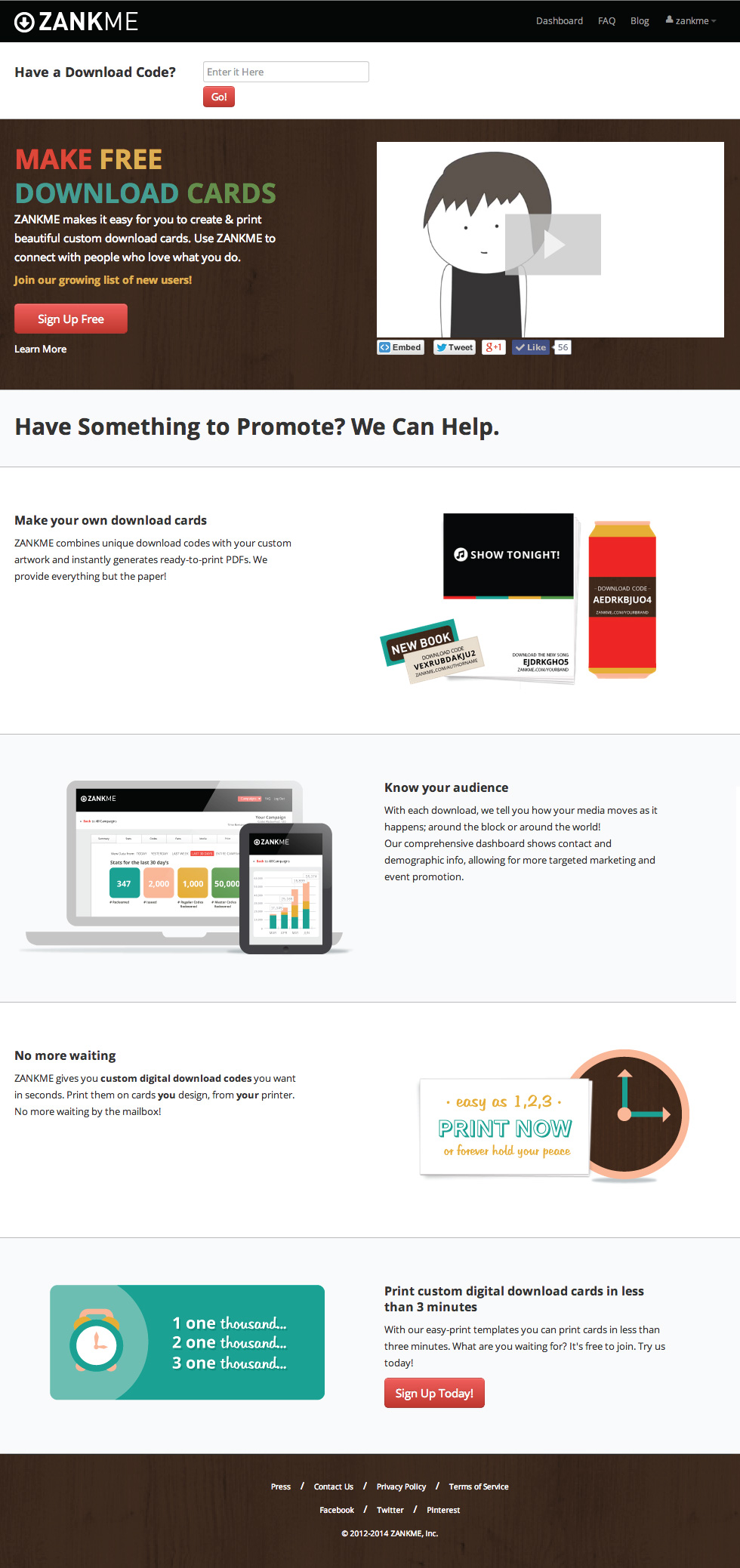
ZANKME is a site that allows anyone (but I’m targeting bands) to upload some music/photos (anything you can put in a zip file) and instantly print download cards with unique codes on them. When a fan redeems the code, he/she must enter an email. So the fan gets some great music, and the musician or band gets to stay in touch via email. That’s how it works. The thing is, most musicians already know what a download card is and how it works. They don’t need to hear it again. What they DO need to hear are the BENEFITS. We’ve all heard this before, right? Benefits, never features!! So, for my site, how about uploading music? Not a benefit. Getting a fan’s email? Slight benefit.
Making more money? Getting more fans? Knowing where your fans are and how to reach them to let them know about your new song or tour in their town? PRICELESS! Those areas are what I want to emphasize. And those are things that you should emphasize for your landing page. Nathan Barry is a huge proponent of thinking in terms of your customers’ dreams. See his very comprehensive post on optimizing your landing page here. I’ll call this a user’s fantasy.
What’s the ultimate fantasy that most of your user have when they come to your site? For me, it’s to become the Rolling Stones. Right? Fame, fortune, millions of fans. If that’s the fantasy or dream, what step does my product provide to get them there?
Ask yourself: What is the ultimate goal that my product or service provides to end users?
Then ask: What very important step does my product/service provide to get my user there?
When you have those answers, EMPHASIZE the heck out them. Scream them from the top of the trees! Cyber trees 😉 In other words, these are the things, the only things, you should put on your put on your landing page. If people want to dive deeper into the details, that’s up to you, and you can provide a how-it-works page. But in most cases that info is best left off the landing page. The intent of the landing page is to encourage one action, be it subscribing to a newsletter. signing up for a service or purchasing a product. In the case of my landing page, it’s sole intent is to drive musicians or promoters to sign up to use the software (as a service).
Let’s take a look at my initial landing page, with no notes. Following it, is a marked-up version, showing my thoughts on each section.
As you look at the page, try to picture yourself as a music promoter or a band, who wants nothing more than to increase band earnings and fame (through fan acquisition). What do you think of each of the elements? Do they speak to your ultimate desire?
Before you scroll to the second image, see if there are any elements you really like/dislike. Make a note of them and see if you agree with my assessment below.
My Assessment – Optimizing my own Landing Page
I took out the magic marker and starting crossing off things I thought could be better. It turns out there was a LOT to do. I realized rather quickly that a full rework was in order.
This is no small task, but if you’re like me, and you believe the benefits would greatly outweigh the time/money spent, then it’s probably worth it. After all, with the current state of my landing page, I just don’t feel that I can convert users. Something has to change.
The main issue was convergence; When I paid for Facebook or Google ads, the click-through-rates were low. How could this be? I was offering a great product, with a low price point and I had explained it so succinctly. Right? Sound familiar? Here’s what I feel is the key to my low CTR and landing page convergence in general: I hadn’t established any trust with my audience. I was expecting to receive sign-ups from a landing page that didn’t offer anything to my users except (in my opinion) a great product. Well, this just isn’t enough. More on that later.
Here’s what I think of the landing page:
Note, I put most of my notes in the left margin and cut off the right side, just so that everything would fit.
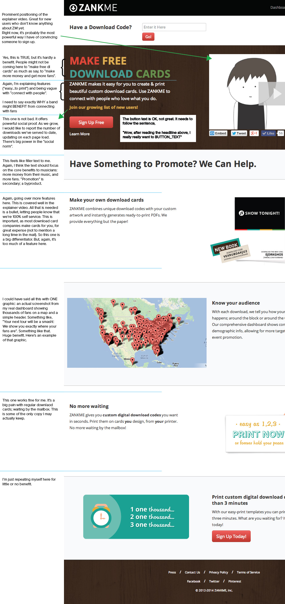
Summary of What was Wrong
So, there are a lot of areas that need help. I mentioned trust, and I definitely need to find a way to earn it. There is also very little in the way of social proof that the service works; no testimonials or use cases. And it was features galore. So, back to the drawing board.
How I Fixed It
The first step was to eliminate all graphics and get to a plain text document and start writing. I identified my perception of the fantasy of my end users: to make more money from music and to have more fans. Then I looked at how my service could help in those two areas. Then I aimed at connecting the two and showing how zankme could help bring in more money and more fans. After several hours of writing and help from my fantastic graphic designer (smilemrb.com), I came to this version.
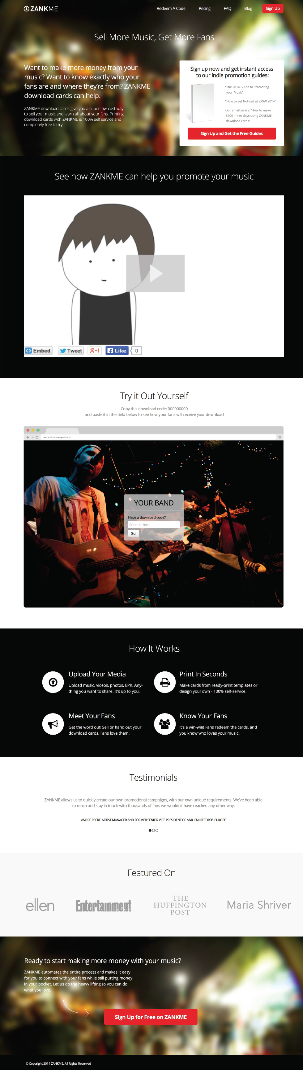
Breakdown of the new Landing Page
I’ll refer to sections as parts of the page separated by a horizontal line, or image break.
Section one headline. Now really emphasizes what the core benefits are: Sell more music, get more fans. The next thing I want to do is tell users a bit more. Hopefully I’ve intrigue them enough to want to know how I can help them achieve these big benefits.
“Want to make more money from your music? Want to know exactly who your fans are and where they’re from? ZANKME download cards can help. ”
This line repeats the headline. I’m not 100% sold that it’s necessary to do this. I’m currently experimenting with different wording here. The point is, I’m trying to lead in to how zankme can help.
Below that subheader is a bit of text that describes exactly what zankme does. It’s important to differentiate my service from the others (100% self-service) and mention the free trial.
As a new element, I’m offering three helpful e-guides, designed to address the needs of independent musicians and promoters (my customers). One is an up-to-date guide to music promotion in 2014. As a long-time musician myself, I am qualified, with a little help from industry friends, to write this guide.
The second guide will only be up for the springtime while bands/managers are preparing for the massive South by Southwest (SXSW) music (and a lot more) conference. I’ve been to this conference and seen what works and what doesn’t. This is a short guide, outlining the must-do’s and must-don’t’s. And finally, I am offering an email series that will SHOW my customers exactly how to execute using zankme. This will be in the form of a 10-part autoresponder series, delivered over the course of 30 days that will show users how to start making money and getting more fans. This is probably the most important part for the business, as it is intended to simultaneously build trust and demonstrate tremendous value. In other words, I’m going to show big the benefits of my service can be.
This is still in the development stage, so these titles and lead-in text will likely change. I’m so excited to get this going that I’m showing this to you here, warts and all. And also to set a bookmark in the process, for comparison against the final page, so you can see the progress.
Section 2 is the explainer video. Here, I’m emphasizing ‘promote your music’. This may become something easier for the new user to swallow, such as, “How it works, in 30 seconds”.
The next section will contain an actual download widget, like you might have as a registered user. You can enter a code and try it out, providing a full demo that an end user would see.
The next section shows a few icons and gives a bit more information about how it all works. There are quite a few moving parts and I wanted to address questions up front. In my opinion, this is the weakest section and may even be unnecessary.
Next two sections: testimonials and featured on. These are social proof. This service is really working. It’s being trusted by lots of musicians and managers. And it’s been featured on some big media sites. If you don’t have these, get some sort of testimonial. Even if it’s from your cousin or uncle or friend across the street. It has to be honest, but it doesn’t necessarily have to be from an industry mogul. Social proof is priceless. It may be argued that this section should reside much higher on the page. This is something I’m considering.
Finally, the bottom should always contain another way for your user to take action. Here, I’ve put another signup button. Looking again at this mock-up, the button text “Sign Up for Free on ZANKME” can be much better. I really don’t think anyone would ever come to my page to “Sign Up”. Please be really careful when you write button text. Users hardly ever want to “Submit”, “Go”, or “Sign Up”. They’re much more likely to want to “Get started now”, or “Get my free guide”, or “Start building something great!”.
Button text should lead the user with this sentence: “After getting to this page, I really want to YOUR_BUTTON_TEXT”. Read this sentence each time you design a button and replace your button text with YOUR_BUTTON_TEXT. Is it compelling? Would you want to click if you were the user? Just this one fix can bring in much higher conversion rates.
Next Time
In my next post, I’ll go through the changes we’re making to this latest revision and unveil the final landing page. I hope this has been helpful. Please let me know in the comments if you agree or disagree with the changes we’re making. Thanks for reading!